Putting the New RiskSmith App Through its Paces
How did it fare in last month’s market thrashings?

In the last issue of Risk Rituals, we talked about a true financial technology revolution of 70 years ago which has yet to fully make its way into the world of individual investors. That’s all about to change.
For two years, we’ve been in stealth mode on what I’m now calling “the new user-experience of finance.” I know that it sounds a bit grandiose, but there’s no doubt that individual investors need a new user-experience of finance, because what is out there today isn’t producing the results that it should.
Back on February 22 of this year, fellow RiskSmith co-founder Justin Davis and I built a portfolio from scratch using our new app. The goal was to build a simple portfolio that we both believed in and that was designed to be risk efficient.

Today at 5pm ET, Justin and I are going LIVE on YouTube to review and adjust the portfolio in real time. Save to your calendar (Thursday, Mar. 24, 5pm ET)
What does risk efficient mean? It means that we’re maximizing the rewards we expect to earn for the risks we’re willing to take. Period.
I’m so gratified by how easy it is to use this new app and build a world-class, professional-grade portfolio in such a short period of time. And it’s fun!
One of the app users wrote, “Within five minutes of signing up I was building a quality portfolio with minimal effort. It is extremely user friendly and intuitive.” We’ve also heard from multiple parents who are using it to teach their young children about finance.
That is music to my ears, I must say. I’ve worked for over two decades to make successful investing more accessible to everyone – and to overcome the forces in retail finance that are out to monetize financial and risk illiteracy. I can honestly say now that we are making some giant strides!
If you want to see how easy it is, watch Justin and I build this new portfolio from scratch on our YouTube channel. But what I really want to focus on today is how this portfolio has performed in the face of serious market headwinds over the month since we built it. Most importantly, I want you to understand WHY it is performing as well as it is because it will help you understand the revolution that Markowitz started 70 years ago this month. If you’re an investor or even thinking about investing, you’re simply not going to succeed without this.
Let’s start by taking a look at the portfolio. You can access a live public version of this portfolio here, but below are screenshots of the portfolio components as of Monday, March 21, 2022:


The first thing I want to draw your attention to is the individual histograms. You can think of these like the hurricane spaghetti plots that we looked at in our last issue to illustrate Markowitz’s critical concepts of mean (i.e., expected return) and variance (i.e., the range of possible returns).
Glancing at the top row, we get the sense that all three of these investments have had more green than red days over the past year. Indeed, they have. The mean daily returns of $TEAM, $ABBV, and $AA were 0.19%, 0.20%, and 0.53%, respectively. The spread of the histogram is what shows us the variance. TEAM and AA both had a lot more variance than ABBV.
It’s interesting that the average daily returns of TEAM and ABBV are nearly identical, but the variance of TEAM is a lot higher than that of ABBV. This is what Markowitz was talking about when he said that the investor should consider “expected return a desirable thing and variance of return an undesirable thing.”
Over the past year ABBV has been a more risk-efficient investment than TEAM. They both produced similar rewards, but ABBV did so with less risk. In our new app we have a Risk Efficiency metric that tells us just that. Over the past year the Risk Efficiency for ABBV was 3.41 while the Risk Efficiency of TEAM was 0.65.
If you’re wondering about the Risk Efficiency of AA, good question! AA has the highest mean daily return at 0.53%. That’s more than double both TEAM and ABBV. It had more variance too, but the reward it produced outweighed the risks taken. It clocked the highest annual Risk Efficiency of the three at 3.78.
Now that you’re hopefully oriented to this at-a-glance view of this portfolio, scan over the whole portfolio above, and I think you’ll start to get why I’m calling this the new user-experience of finance.
Now let’s look at the top-line stats for this portfolio:

What we’re seeing here is the one-year histogram of daily returns for the entire portfolio with a couple of key stats. We’ve already covered what Risk Efficiency is. dScore is an estimate of what you should expect your worst down day to be at minimum in any given month.
All other things being equal, the higher the Risk Efficiency the better, and the lower the dScore the better.
Now I’d like to draw your attention to the fact that the total portfolio histogram is more compact in the middle (i.e., has less variance) than any single investment histogram in the portfolio. Compare this histogram to any of the histograms above and you’ll see what I mean. This is no accident. In fact, it’s the heart of the matter.
Over the past year this portfolio has had an average daily gain of 0.13%, and it did so with a very compact histogram! That’s why the Risk Efficiency for the overall portfolio is so high at 3.22. (A minimum acceptable Risk Efficiency is 1.0. Above 2.0 is very good, and above 3.0 is great!)
How is it possible that such a diverse group of individual histograms add up to a single histogram that is more compact than any of the histograms of the individual investments? That’s the magic of putting together a portfolio of minimally correlated investments.
To visualize that dynamic, we turn to the covariance matrix for this portfolio – a view you can see in our app for any portfolio you want:

What we’ve got is a grid with all of the investment tickers across the top and down the left side. If you pick a ticker from the top and a ticker from the side and find where they intersect on the grid, it tells you how strongly correlated those two investments are.
If we pick AA from the top and ABBV from the left side, we can see that the correlation between these two is 0.085. We want correlations as close to zero as possible, so this is pretty darn good.
You don’t need to pay much attention to the numbers in each square. All you really need to do is to look at the colors. Bright green means strongly correlated. Black means uncorrelated. The bright green diagonal down the middle is the correlation of each asset to itself. Those squares are bright green because each asset is perfectly correlated to itself. Looking at the rest of the squares, there’s a lot of black and dim green. That’s good! And that’s primarily why our total portfolio histogram is more compact than any of the histograms for the individual assets.
There is another reason why we ended up with such a low-variance portfolio even though the portfolio is filled with plenty of high-variance investments. We used volatility-based position sizing. We put more capital into the least volatile investments and less capital into the most volatile investments.
You can see this if you look at the images of individual investments above. The percentage capital allocation to each investment is in the upper right-hand corner. Compact histograms like GLD get the biggest allocations (15.05%). More spread-out histograms like BTC-USD get smaller allocations (2.84%).
I like to explain this best practice by using a culinary metaphor. The low-variance investments are like the main course of a meal. The high-variance investments are like the spices and garnishes. Great spices and garnishes can really add to a meal, but you don’t want them to be the main course! Your meat and potatoes are your low-variance investments.
These two tools of volatility-based position sizing and correlation minimization are incredibly powerful tools, and they are virtually unknown in the world of retail investing. If you’re not using these tools, you simply have to start now. I know they will improve your performance and help you sleep better at night!
So how has this portfolio actually performed over the past month of market thrashings since we built it? Exactly as designed, I’m happy to say.
Here’s a chart of the one-month performance of this portfolio against the standard benchmarks. Our portfolio is the blue line versus the S&P 500 (orange), Dow 30 (gray), and the Nasdaq Composite (yellow):
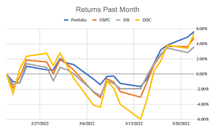
Over the past month, our portfolio has managed to slightly outpace all three benchmarks while doing so with the least risk of all. You can see that because the blue line had the lowest drawdown of all while still posting the highest overall gains.
Anyone can easily build a portfolio like this in 30 minutes or less. Everyone’s portfolios should be built to be risk efficient. Risk less. Make more.
Now you can do it too by joining us at RiskSmith.com. The app is free. The value is priceless!
When forced to choose, I will not trade even a night's sleep for the chance of extra profits.
Warren Buffett, Chairman and CEO of Berkshire Hathaway